
SchoolConnect
SchoolConnect
Role
End to End Product Designer
Program
CareerFoundry Product Design
Region
USA/Canada
Year
2024-2025
Duration
12 - 16 months
Platform
Desktop & Mobile

PROJECT OVERVIEW
SchoolConnect is a responsive web platform that connects international and out-of-province students with verified university professors and alumni for booked one-on-one video consultations. It gives students a trustworthy, structured way to get firsthand academic guidance instead of piecing decisions together from scattered, unverified sources.
Problem:
Students researching universities, courses, and applications are overwhelmed by inconsistent, unverified information across social media, forums, and ranking sites, with no reliable, direct way to reach the professors and alumni who actually have answers. The result is low confidence and high-stakes decisions made on incomplete information.
Goal:
Design a trustworthy, guided platform that lets students discover verified experts, evaluate them quickly, and book a video consultation with minimal friction, reducing decision anxiety while keeping the experience simple, transparent, and credible.
My role:
Lead Product Designer, owning the project end-to-end — research, information architecture, interaction design, visual system, and developer-ready handoff across desktop and mobile web.
Responsibilities:
Primary research (user interviews, surveys)
Secondary research (competitive analysis, content audit)
Affinity mapping, empathy maps, personas, and journey mapping
Task analysis, user flows, information architecture, and card sorting
Low-, mid-, and high-fidelity design in Figma
Moderated usability testing and preference (A/B) testing
Accessibility auditing against WCAG 2.1 AA
Token-driven design system and responsive layouts
Annotated developer handoff
PROJECT OVERVIEW
SchoolConnect is a responsive web platform that connects international and out-of-province students with verified university professors and alumni for booked one-on-one video consultations. It gives students a trustworthy, structured way to get firsthand academic guidance instead of piecing decisions together from scattered, unverified sources.
Problem:
Students researching universities, courses, and applications are overwhelmed by inconsistent, unverified information across social media, forums, and ranking sites, with no reliable, direct way to reach the professors and alumni who actually have answers. The result is low confidence and high-stakes decisions made on incomplete information.
Goal:
Design a trustworthy, guided platform that lets students discover verified experts, evaluate them quickly, and book a video consultation with minimal friction, reducing decision anxiety while keeping the experience simple, transparent, and credible.
My role:
Lead Product Designer, owning the project end-to-end — research, information architecture, interaction design, visual system, and developer-ready handoff across desktop and mobile web.
Responsibilities:
Primary research (user interviews, surveys)
Secondary research (competitive analysis, content audit)
Affinity mapping, empathy maps, personas, and journey mapping
Task analysis, user flows, information architecture, and card sorting
Low-, mid-, and high-fidelity design in Figma
Moderated usability testing and preference (A/B) testing
Accessibility auditing against WCAG 2.1 AA
A token-driven design system and responsive layouts
Annotated developer handoff
PROJECT OVERVIEW
SchoolConnect is a responsive web platform that connects international and out-of-province students with verified university professors and alumni for booked one-on-one video consultations. It gives students a trustworthy, structured way to get firsthand academic guidance instead of piecing decisions together from scattered, unverified sources.
Problem:
Students researching universities, courses, and applications are overwhelmed by inconsistent, unverified information across social media, forums, and ranking sites, with no reliable, direct way to reach the professors and alumni who actually have answers. The result is low confidence and high-stakes decisions made on incomplete information.
Goal:
Design a trustworthy, guided platform that lets students discover verified experts, evaluate them quickly, and book a video consultation with minimal friction, reducing decision anxiety while keeping the experience simple, transparent, and credible.
My role:
Lead Product Designer, owning the project end-to-end — research, information architecture, interaction design, visual system, and developer-ready handoff across desktop and mobile web.
Responsibilities:
Primary research (user interviews, surveys)
Secondary research (competitive analysis, content audit)
Affinity mapping, empathy maps, personas, and journey mapping
Task analysis, user flows, information architecture, and card sorting
Low-, mid-, and high-fidelity design in Figma
Moderated usability testing and preference (A/B) testing
Accessibility auditing against WCAG 2.1 AA
A token-driven design system and responsive layouts
Annotated developer handoff
USER RESEARCH
I combined primary and secondary research: user interviews and surveys with students and a professor, plus a competitive analysis of LinkedIn and EdScholar. A clear pattern emerged, students don't lack information, they lack trustworthy information and a direct line to credible people. The core problem was confidence, not discoverability.
The signals were consistent: low trust in online sources, a strong preference for one-on-one video, and genuine willingness to pay for verified guidance. On the supply side, professors wanted to help but needed a structured, schedule-based way to do it , not cold outreach.
User Interviews
I conducted one-on-one interviews to understand the why behind the survey data , remote sessions (Zoom/phone, ~30–40 minutes), recorded with consent and transcribed. I interviewed 3 students and 1 professor/alumnus, covering both sides of the platform.
Students: Students could find information easily but had no way to judge what was credible. None had a direct line to verified experts, cold outreach went unanswered, and paid consultants felt opaque about real job outcomes. The result was decision paralysis on high-stakes choices.
Professor/Alumni: The professor was willing to mentor but had no structured way to do it, cold emails and LinkedIn were unmanageable, with no way to handle scheduling. They wanted booked, schedule-based requests over ad-hoc outreach. This shaped SchoolConnect's verified-expert and structured-booking direction.
Competitive Analysis
I analysed the two platforms students already turn to , LinkedIn and EdScholar to find the gap SchoolConnect could own.
LinkedIn has the people but no structure: a credible expert network, but no way to book a verified 1:1 session.
EdScholar has the structure but no people: AI recommendations and a clean UI, but no real-time interaction or verified mentorship.
Neither closes the gap. SchoolConnect sits in it: verified experts, booked video/chat sessions, trust by default.

Content Auditing
I audited EdScholar's content to see how it presents experts, credibility, and session details. The gaps were clear: weak trust cues, no visible outcomes, and no structured path to booking. These findings shaped SchoolConnect's content priorities, verified credentials, clear session details, and trust signals at every step.

User Survey
Surveys with students, professors, and alumni gave directional, qualitative signal, consistently pointing to low trust in online information, a preference for one-on-one video, and willingness to pay for verified guidance, which fed the affinity mapping and personas.


Affinity Mapping
After collecting survey and interview data from students and professors, I used affinity mapping to cluster raw, scattered observations into patterns. Each colour represents one research participant, so I could see how individual experiences grouped into shared themes, turning unstructured research into the insights that shaped the personas and pain points.


USER RESEARCH
I combined primary and secondary research: user interviews and surveys with students and a professor, plus a competitive analysis of LinkedIn and EdScholar. A clear pattern emerged, students don't lack information, they lack trustworthy information and a direct line to credible people. The core problem was confidence, not discoverability.
The signals were consistent: low trust in online sources, a strong preference for one-on-one video, and genuine willingness to pay for verified guidance. On the supply side, professors wanted to help but needed a structured, schedule-based way to do it , not cold outreach.
Competitive Analysis
I analysed the two platforms students already turn to , LinkedIn and EdScholar to find the gap SchoolConnect could own.
LinkedIn has the people but no structure: a credible expert network, but no way to book a verified 1:1 session.
EdScholar has the structure but no people: AI recommendations and a clean UI, but no real-time interaction or verified mentorship.
Neither closes the gap. SchoolConnect sits in it: verified experts, booked video/chat sessions, trust by default.
User Interviews
I conducted one-on-one interviews to understand the why behind the survey data , remote sessions (Zoom/phone, ~30–40 minutes), recorded with consent and transcribed. I interviewed 3 students and 1 professor/alumnus, covering both sides of the platform.
Students: Students could find information easily but had no way to judge what was credible. None had a direct line to verified experts, cold outreach went unanswered, and paid consultants felt opaque about real job outcomes. The result was decision paralysis on high-stakes choices.
Professor/Alumni: The professor was willing to mentor but had no structured way to do it, cold emails and LinkedIn were unmanageable, with no way to handle scheduling. They wanted booked, schedule-based requests over ad-hoc outreach. This shaped SchoolConnect's verified-expert and structured-booking direction.
Content Auditing
I audited EdScholar's content to see how it presents experts, credibility, and session details. The gaps were clear: weak trust cues, no visible outcomes, and no structured path to booking. These findings shaped SchoolConnect's content priorities, verified credentials, clear session details, and trust signals at every step.
User Survey
Surveys with students, professors, and alumni gave directional, qualitative signal, consistently pointing to low trust in online information, a preference for one-on-one video, and willingness to pay for verified guidance, which fed the affinity mapping and personas.
Affinity Mapping
After collecting survey and interview data from students and professors, I used affinity mapping to cluster raw, scattered observations into patterns. Each colour represents one research participant, so I could see how individual experiences grouped into shared themes, turning unstructured research into the insights that shaped the personas and pain points.
USER RESEARCH
I combined primary and secondary research: user interviews and surveys with students and a professor, plus a competitive analysis of LinkedIn and EdScholar. A clear pattern emerged, students don’t lack information, they lack trustworthy information and a direct line to credible people. The core problem was confidence, not discoverability.
The signals were consistent: low trust in online sources, a strong preference for one-on-one video, and genuine willingness to pay for verified guidance. On the supply side, professors wanted to help but needed a structured, schedule-based way to do it , not cold outreach.
User Interviews
I conducted one-on-one interviews to understand the why behind the survey data , remote sessions (Zoom/phone, ~30–40 minutes), recorded with consent and transcribed. I interviewed 3 students and 1 professor/alumnus, covering both sides of the platform.
Students: Students could find information easily but had no way to judge what was credible. None had a direct line to verified experts, cold outreach went unanswered, and paid consultants felt opaque about real job outcomes. The result was decision paralysis on high-stakes choices.
Professor/Alumni: The professor was willing to mentor but had no structured way to do it, cold emails and LinkedIn were unmanageable, with no way to handle scheduling. They wanted booked, schedule-based requests over ad-hoc outreach. This shaped SchoolConnect's verified-expert and structured-booking direction.
Competitive Analysis
I analysed the two platforms students already turn to , LinkedIn and EdScholar to find the gap SchoolConnect could own.
LinkedIn has the people but no structure: a credible expert network, but no way to book a verified 1:1 session.
EdScholar has the structure but no people: AI recommendations and a clean UI, but no real-time interaction or verified mentorship.
Neither closes the gap. SchoolConnect sits in it: verified experts, booked video/chat sessions, trust by default.
Content Auditing
I audited EdScholar's content to see how it presents experts, credibility, and session details. The gaps were clear: weak trust cues, no visible outcomes, and no structured path to booking. These findings shaped SchoolConnect's content priorities, verified credentials, clear session details, and trust signals at every step.
User Survey
Surveys with students, professors, and alumni gave directional, qualitative signal, consistently pointing to low trust in online information, a preference for one-on-one video, and willingness to pay for verified guidance, which fed the affinity mapping and personas.
Affinity Mapping
After collecting survey and interview data from students and professors, I used affinity mapping to cluster raw, scattered observations into patterns. Each colour represents one research participant, so I could see how individual experiences grouped into shared themes, turning unstructured research into the insights that shaped the personas and pain points.
DEFINE
With the research in hand, I turned raw findings into a point of view. I distilled the recurring signals into core pain points, synthesized them into three personas , a current student, a recent graduate, and a professor , grounded in empathy maps, and traced the student’s journey from first awareness through booking and advocacy.
One insight anchored everything that followed: the problem wasn’t a lack of information , it was a lack of trust and a direct line to credible people. That reframing defined what SchoolConnect had to be.
Empathy Mapping
To turn research into a shared point of view, I built empathy maps for each persona, capturing what they say, think, do, and feel, straight from interview and survey quotes. Mapping all four quadrants surfaced one consistent signal across every persona: the problem wasn't a lack of information, it was a lack of trust and a direct line to credible people. That insight anchored every design decision that followed.


Pain Points
Finding reliable guidance:
Students sift through social media, forums, and rankings with no way to separate credible advice from noise, leading to overload and low trust.
Accessing trusted experts:
There's no direct, structured channel to professors or alumni. The few who try face unanswered cold emails and vague replies.
Deciding with confidence:
Without verified comparisons or firsthand insight into outcomes, students hesitate and decide on incomplete information.
User Personas
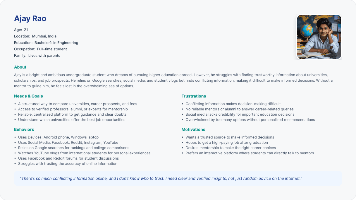
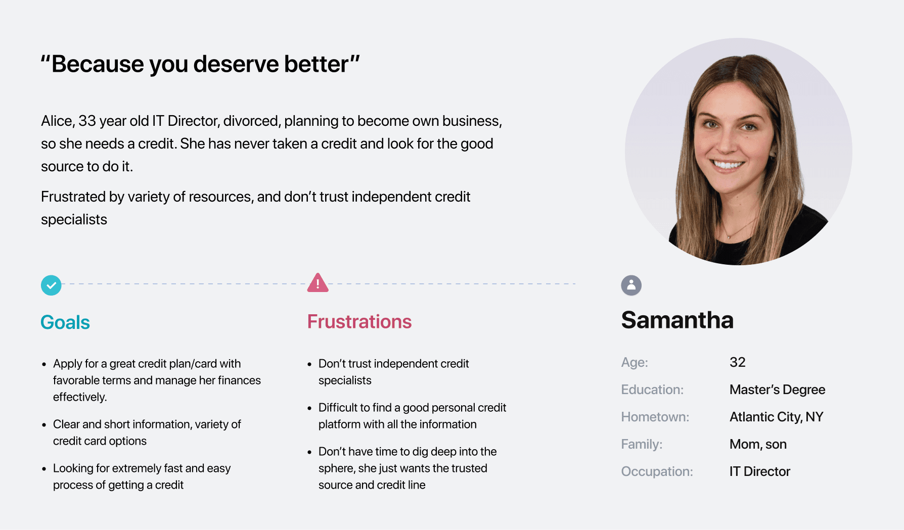
I developed personas from interviews and surveys with students and professors, synthesizing the patterns into archetypes that represent the people SchoolConnect serves. Each persona is tied directly to the research findings and pain points, keeping design decisions anchored to real needs.


User Journey Map
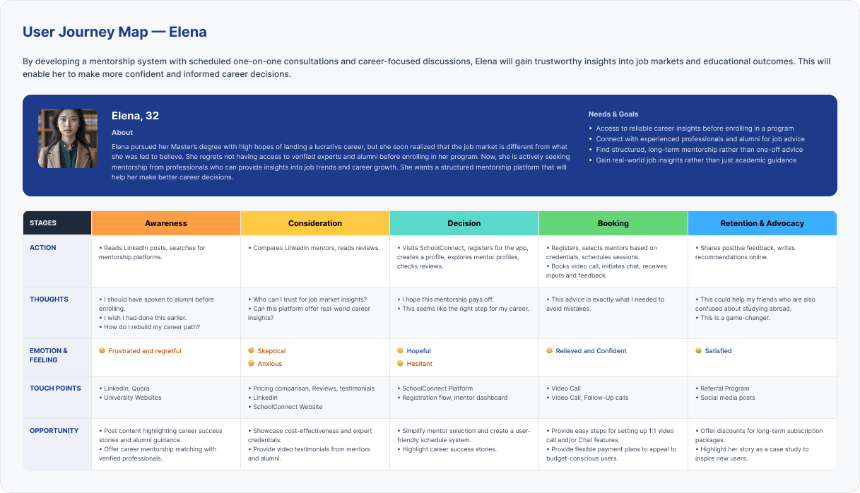
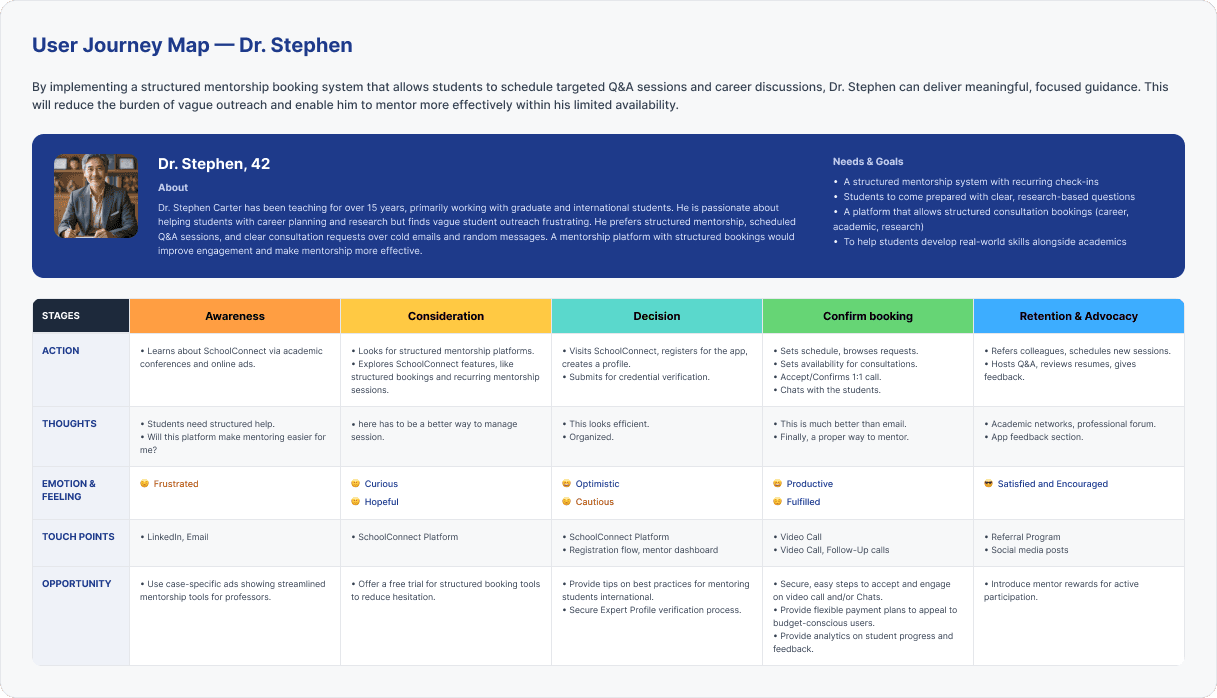
I mapped each persona's journey through SchoolConnect across five stages — from first awareness to retention , capturing their actions, thoughts, emotional highs and lows, touchpoints, and the design opportunities at each step. This is where research turns into a stage-by-stage view of where to build trust and remove friction.
I built journey maps for all three personas so the design serves both sides of the marketplace , two students with different goals and the expert who supplies guidance. Each map traces the emotional arc from overwhelmed and anxious to relieved, confident, and empowered, and surfaces the specific opportunities that shaped the flows I designed.

DEFINE
With the research in hand, I turned raw findings into a point of view. I distilled the recurring signals into core pain points, synthesized them into three personas — a current student, a recent graduate, and a professor , grounded in empathy maps, and traced the student’s journey from first awareness through booking and advocacy.
One insight anchored everything that followed: the problem wasn’t a lack of information , it was a lack of trust and a direct line to credible people. That reframing defined what SchoolConnect had to be.
Emphathy Mapping
To turn research into a shared point of view, I built empathy maps for each persona, capturing what they say, think, do, and feel, straight from interview and survey quotes. Mapping all four quadrants surfaced one consistent signal across every persona: the problem wasn't a lack of information, it was a lack of trust and a direct line to credible people. That insight anchored every design decision that followed.
Pain Points
Finding reliable guidance:
Students sift through social media, forums, and rankings with no way to separate credible advice from noise, leading to overload and low trust
Accessing trusted experts:
There's no direct, structured channel to professors or alumni. The few who try face unanswered cold emails and vague replies.
Deciding with confidence:
Without verified comparisons or firsthand insight into outcomes, students hesitate and decide on incomplete information.
User Personas
I developed personas from interviews and surveys with students and professors, synthesizing the patterns into archetypes that represent the people SchoolConnect serves. Each persona is tied directly to the research findings and pain points, keeping design decisions anchored to real needs.
User Journey Map
I mapped each persona's journey through SchoolConnect across five stages — from first awareness to retention , capturing their actions, thoughts, emotional highs and lows, touchpoints, and the design opportunities at each step. This is where research turns into a stage-by-stage view of where to build trust and remove friction.
I built journey maps for all three personas so the design serves both sides of the marketplace — two students with different goals and the expert who supplies guidance. Each map traces the emotional arc from overwhelmed and anxious to relieved, confident, and empowered, and surfaces the specific opportunities that shaped the flows I designed.
DEFINE
With the research in hand, I turned raw findings into a point of view. I distilled the recurring signals into core pain points, synthesized them into three personas — a current student, a recent graduate, and a professor , grounded in empathy maps, and traced the student’s journey from first awareness through booking and advocacy.
One insight anchored everything that followed: the problem wasn’t a lack of information , it was a lack of trust and a direct line to credible people. That reframing defined what SchoolConnect had to be.
Emphathy Mapping
To turn research into a shared point of view, I built empathy maps for each persona, capturing what they say, think, do, and feel, straight from interview and survey quotes. Mapping all four quadrants surfaced one consistent signal across every persona: the problem wasn't a lack of information, it was a lack of trust and a direct line to credible people. That insight anchored every design decision that followed.
Pain Points
Finding reliable guidance:
Students sift through social media, forums, and rankings with no way to separate credible advice from noise, leading to overload and low trust
Accessing trusted experts:
There’s no direct, structured channel to professors or alumni. The few who try face unanswered cold emails and vague replies.
Deciding with confidence:
Without verified comparisons or firsthand insight into outcomes, students hesitate and decide on incomplete information.
User Personas
I developed personas from interviews and surveys with students and professors, synthesizing the patterns into archetypes that represent the people SchoolConnect serves. Each persona is tied directly to the research findings and pain points, keeping design decisions anchored to real needs.
User Journey Map
I mapped each persona's journey through SchoolConnect across five stages — from first awareness to retention , capturing their actions, thoughts, emotional highs and lows, touchpoints, and the design opportunities at each step. This is where research turns into a stage-by-stage view of where to build trust and remove friction.
I built journey maps for all three personas so the design serves both sides of the marketplace — two students with different goals and the expert who supplies guidance. Each map traces the emotional arc from overwhelmed and anxious to relieved, confident, and empowered, and surfaces the specific opportunities that shaped the flows I designed.
IDEATE
With the problem clearly defined, I moved from insight to structure. Before designing a single screen, I established the product's skeleton: card sorting to let real mental models shape the navigation, a site map and information architecture to organize the platform, task analysis to map how users actually move toward a goal, and user flows to connect those tasks into coherent paths. Wireframes came last, not as a starting point, but as the payoff of that groundwork.
This sequence reflects how I lead design: architecture before aesthetics. Grounding the IA in card-sorting data meant the structure was validated by users, not assumed by me, so every screen that followed sat on a foundation I could defend, not just decorate.
Userflow
Student and advisor flows built in three passes — task analysis → task flow → user flows — so every step traces back to a documented task and a real need.
To make sure the flows reflected real user goals, not my assumptions, I worked the logic out in three passes before opening the canvas: task analysis → task flow → user flows.
I ran it for both sides of the marketplace , the student and the advisor, so every flow traces back to a documented task and a real need.
How I built it: I started with task analysis, breaking each core task down with the same five questions and pairing it with a user story. From there I wrote the task flow as explicit steps , including the returning-user path and the error branches (failed payment, reschedule, offline advisor), which surfaced edge cases in words before they became redesigns.
What it produced: two user flows with real screens and decision points: The student's discover → book → pay → attend → review path, and the advisor's verify → review requests → accept / reschedule → run session path. Because the logic was already pressure-tested, the diagrams could focus on navigation and branching, not behavior..


Sitemap
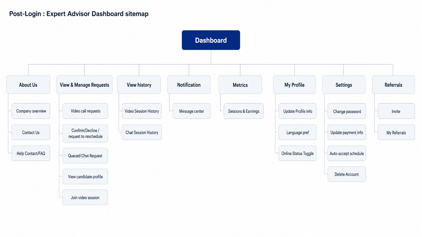
The sitemap turns the card-sort groupings into the platform's structure — covering both the student and advisor sides end-to-end. Every category traces back to a validated group, so the navigation reflects real mental models, not my assumptions.
Next step: creating the site map. I translated the card-sort results into a clear structure: one shared pre-login experience, then separate dashboards for students and advisors, each mapped end-to-end.
Splitting the dashboards was a deliberate decision — students and advisors have different goals, so a shared navigation would bury the actions each role needs most. The advisor side is fully architected here and in the user flows; the high-fidelity design phase then focused on the student journey first.

Card Sorting
To ground the platform's structure in how people actually think, I ran a closed card sort (UX Tweak) with students and experts, letting them file each task under the categories that made sense to them. Their groupings became the blueprint for the navigation: a sitemap shaped by real mental models, not just my own.
The card sort revealed clear patterns in how students and experts expect the platform to be organized. I ran it across both roles, then translated the strongest agreement into navigation decisions.
What the data showed: students grouped tasks with high consensus, Filter & Search Experts and View Expert Profiles landed under Explore Experts unanimously, while session actions (reschedule, cancel, join, follow-up) consistently clustered under My Sessions. The expert sort, though a smaller group, confirmed the same instinct: session-handling tasks grouped under Manage Requests, and informational items under About Us.
What it changed: I let those groupings reshape the sitemap rather than force my original structure
Merged Modify and Reschedule into a single action, removing redundant paths
Moved View History under My Sessions, consolidating session-related actions
Grouped Help/FAQ and Contact Us under Settings for a single support destination
Renamed several labels to be clearer and more action-driven


Cross Platform
A feature-level plan that maps every page and action across mobile, desktop, and tablet. Before designing screens, I decided where each feature lives and how its content adapts per device, so the layouts stay mobile-first and consistent across platforms.
Next step: Deciding how the product behaves across devices. I audited all 25 + core features and mapped each one to the platforms it needs to support, the content it carries, and the persona it serves, with a short justification for every decision.
This surfaced platform-specific trade-offs early, before any visual design. Complex or sensitive tasks like payments and ID upload are favored on larger screens, while quick actions stay fully mobile-first. The result is a clear reference that kept the wireframes and high-fidelity screens consistent across mobile, desktop, and tablet.

Digital Wireframes
A clearer, digital version of the wireframes built in Figma. All the important pages are added and connected into one structure, so the layout and content hierarchy are locked before any visual design.
On this step I used Figma to create digital wireframes of the core pages across desktop and mobile. I then connected all of them into one clear, smooth structure so each screen flows logically into the next.
The goal was to show how all the pages interact with each other, keeping everything grayscale so feedback stayed on structure rather than color. Every screen traces back to a user flow and a site-map node, which kept the layout decisions grounded in earlier research.
Scope decision (MVP): Research, flows, and IA cover both students and expert advisors. For screen design I focused on the student post-login experience (the core booking loop), and represented the expert advisor side with a pre-login applic

Card Sorting
To ground the platform's structure in how people actually think, I ran a closed card sort (UX Tweak) with students and experts , lletting them file each task under the categories that made sense to them.
Their groupings became the blueprint for the navigation: a sitemap shaped by real mental models, not just my own.
The card sort revealed clear patterns in how students and experts expect the platform to be organized. I ran it across both roles, then translated the strongest agreement into navigation decisions.
What the data showed: students grouped tasks with high consensus, Filter & Search Experts and View Expert Profiles landed under Explore Experts unanimously, while session actions (reschedule, cancel, join, follow-up) consistently clustered under My Sessions. The expert sort, though a smaller group, confirmed the same instinct: session-handling tasks grouped under Manage Requests, and informational items under About Us.
What it changed: I let those groupings reshape the sitemap rather than force my original structure
Merged Modify and Reschedule into a single action, removing redundant paths
Moved View History under My Sessions, consolidating session-related actions
Grouped Help/FAQ and Contact Us under About Us for a single support destination
Renamed several labels to be clearer and more action-driven
IDEATE
With the problem clearly defined, I moved from insight to structure. Before designing a single screen, I established the product's skeleton: card sorting to let real mental models shape the navigation, a site map and information architecture to organize the platform, task analysis to map how users actually move toward a goal, and user flows to connect those tasks into coherent paths. Wireframes came last, not as a starting point, but as the payoff of that groundwork.
This sequence reflects how I lead design: architecture before aesthetics. Grounding the IA in card-sorting data meant the structure was validated by users, not assumed by me, so every screen that followed sat on a foundation I could defend, not just decorate.
Userflow
Student and advisor flows built in three passes — task analysis → task flow → user flows — so every step traces back to a documented task and a real need.
To make sure the flows reflected real user goals, not my assumptions, I worked the logic out in three passes before opening the canvas: task analysis → task flow → user flows.
I ran it for both sides of the marketplace , the student and the advisor, so every flow traces back to a documented task and a real need.
How I built it: I started with task analysis, breaking each core task down with the same five questions and pairing it with a user story. From there I wrote the task flow as explicit steps , including the returning-user path and the error branches (failed payment, reschedule, offline advisor), which surfaced edge cases in words before they became redesigns.
What it produced: two user flows with real screens and decision points: The student's discover → book → pay → attend → review path, and the advisor's verify → review requests → accept / reschedule → run session path. Because the logic was already pressure-tested, the diagrams could focus on navigation and branching, not behavior.
Next step: creating the site map. I translated the card-sort results into a clear structure: one shared pre-login experience, then separate dashboards for students and advisors, each mapped end-to-end.
Splitting the dashboards was a deliberate decision — students and advisors have different goals, so a shared navigation would bury the actions each role needs most. The advisor side is fully architected here and in the user flows; the high-fidelity design phase then focused on the student journey first.
Sitemap
The sitemap turns the card-sort groupings into the platform's structure — covering both the student and advisor sides end-to-end. Every category traces back to a validated group, so the navigation reflects real mental models, not my assumptions.
Next step: deciding how the product behaves across devices. I audited all 33 core features and mapped each one to the platforms it needs to support, the content it carries, and the persona it serves, with a short justification for every decision.
This surfaced platform-specific trade-offs early, before any visual design. Complex or sensitive tasks like payments and ID upload are favored on larger screens, while quick actions stay fully mobile-first. The result is a clear reference that kept the wireframes and high-fidelity screens consistent across mobile, desktop, and tablet.
Cross Platform
A feature-level plan that maps every page and action across mobile, desktop, and tablet. Before designing screens, I decided where each feature lives and how its content adapts per device, so the layouts stay mobile-first and consistent across platforms.
Digital Wireframes
A clearer, digital version of the wireframes built in Figma. All the important pages are added and connected into one structure, so the layout and content hierarchy are locked before any visual design.
On this step I used Figma to create digital wireframes of the core pages across desktop and mobile. I then connected all of them into one clear, smooth structure so each screen flows logically into the next.
The goal was to show how all the pages interact with each other, keeping everything grayscale so feedback stayed on structure rather than color. Every screen traces back to a user flow and a site-map node, which kept the layout decisions grounded in earlier research.
Scope decision (MVP): Research, flows, and IA cover both students and expert advisors. For screen design I focused on the student post-login experience (the core booking loop), and represented the expert advisor side with a pre-login application form. The expert advisor dashboard is specified in the flows and site map as the next build.
IDEATE
With the problem clearly defined, I moved from insight to structure. Before designing a single screen, I established the product’s skeleton: card sorting to let real mental models shape the navigation, a site map and information architecture to organize the platform, task analysis to map how users actually move toward a goal, and user flows to connect those tasks into coherent paths. Wireframes came last, not as a starting point, but as the payoff of that groundwork.
This sequence reflects how I lead design: architecture before aesthetics. Grounding the IA in card-sorting data meant the structure was validated by users, not assumed by me, so every screen that followed sat on a foundation I could defend, not just decorate.
Userflow
Student and advisor flows built in three passes — task analysis → task flow → user flows — so every step traces back to a documented task and a real need.
To make sure the flows reflected real user goals, not my assumptions, I worked the logic out in three passes before opening the canvas: task analysis → task flow → user flows.
I ran it for both sides of the marketplace , the student and the advisor, so every flow traces back to a documented task and a real need.
How I built it: I started with task analysis, breaking each core task down with the same five questions and pairing it with a user story. From there I wrote the task flow as explicit steps , including the returning-user path and the error branches (failed payment, reschedule, offline advisor), which surfaced edge cases in words before they became redesigns.
What it produced: two user flows with real screens and decision points: The student’s discover → book → pay → attend → review path, and the advisor’s verify → review requests → accept / reschedule → run session path. Because the logic was already pressure-tested, the diagrams could focus on navigation and branching, not behavior.
Sitemap
The sitemap turns the card-sort groupings into the platform's structure — covering both the student and advisor sides end-to-end. Every category traces back to a validated group, so the navigation reflects real mental models, not my assumptions.
Next step: creating the site map. I translated the validated card-sort groupings into a clear structure, one shared pre-login experience, then separate dashboards for students and advisors.
Splitting the dashboards was a deliberate decision. Students and advisors have different goals, so a single shared navigation would bury the actions each role needs most. Every category traces back to a card-sort group.
Cross Platform
A feature-level plan that maps every page and action across mobile, desktop, and tablet. Before designing screens, I decided where each feature lives and how its content adapts per device, so the layouts stay mobile-first and consistent across platforms.
Next step: deciding how the product behaves across devices. I audited all 33 core features and mapped each one to the platforms it needs to support, the content it carries, and the persona it serves, with a short justification for every decision.
This surfaced platform-specific trade-offs early, before any visual design. Complex or sensitive tasks like payments and ID upload are favored on larger screens, while quick actions stay fully mobile-first. The result is a clear reference that kept the wireframes and high-fidelity screens consistent across mobile, desktop, and tablet.
Digital Wireframes
A clearer, digital version of the wireframes built in Figma. All the important pages are added and connected into one structure, so the layout and content hierarchy are locked before any visual design.
On this step I used Figma to create digital wireframes of the core pages across desktop and mobile. I then connected all of them into one clear, smooth structure so each screen flows logically into the next.
The goal was to show how all the pages interact with each other, keeping everything grayscale so feedback stayed on structure rather than color. Every screen traces back to a user flow and a site-map node, which kept the layout decisions grounded in earlier research.
Scope decision (MVP): Research, flows, and IA cover both students and expert advisors. For screen design I focused on the student post-login experience (the core booking loop), and represented the expert advisor side with a pre-login application form. The expert advisor dashboard is specified in the flows and site map as the next build.
Card Sorting
To ground the platform's structure in how people actually think, I ran a closed card sort (UX Tweak) with students and experts, letting them file each task under the categories that made sense to them. Their groupings became the blueprint for the navigation: a sitemap shaped by real mental models, not just my own.
The card sort revealed clear patterns in how students and experts expect the platform to be organized. I ran it across both roles, then translated the strongest agreement into navigation decisions.
What the data showed: students grouped tasks with high consensus, Filter & Search Experts and View Expert Profiles landed under Explore Experts unanimously, while session actions (reschedule, cancel, join, follow-up) consistently clustered under My Sessions. The expert sort, though a smaller group, confirmed the same instinct: session-handling tasks grouped under Manage Requests, and informational items under About Us.
What it changed: I let those groupings reshape the sitemap rather than force my original structure
Merged Modify and Reschedule into a single action, removing redundant paths
Moved View History under My Sessions, consolidating session-related actions
Grouped Help/FAQ and Contact Us under About Us for a single support destination
Renamed several labels to be clearer and more action-driven
DESIGN
With the structure and first build in place, I moved into refining the product. I treated this as an iteration loop, not a single pass: design, test, learn, and rebuild. Across two high-fidelity versions, SchoolConnect evolved from a functional first direction into a systematic, accessible product.
This stage walks through that journey. It covers the Version 1 high-fidelity design and the usability testing that exposed its gaps, the feedback I gathered and acted on, and the full Version 2 redesign built on a unified design system, with preference testing settling the final login. Every change traces back to a specific finding, so the result reflects evidence, not preference.
High-Fidelity Design, Version 1
My first high-fidelity build of SchoolConnect. A research-led colour direction, a preliminary palette, components, and icons, taken to a realistic, testable product.
I began with the visual language. To ground the colour direction in something students already trust, I studied leading education platforms including EdScholar, LinkedIn, Coursera, Mobbin, UIcolorsapp, ChatGPT to widen the options and pressure-test them. Using colour theory, I developed two directions: a trustworthy blue with a warm orange accent, and a calmer teal and blue. I committed to blue and orange for Version 1 and deliberately parked the teal and blue as a tested alternative.
At this stage the system was intentionally preliminary, a first-round palette, a starter component set, and core icons, enough to take the wireframes to high fidelity. I had not yet formalised design tokens or a full component library. I then designed the core booking flow end to end, from pre-login discovery through booking and payment, to create the version I put in front of users in the next stage.


Usability Testing
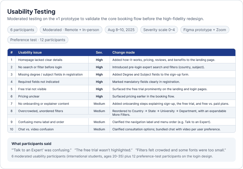
I tested the Version 1 prototype with real users to find friction before refining the design. I ran moderated sessions with a structured test plan, task-based scenarios, and a severity scale.
I approached testing the way I run UAT on banking programs, with a plan before a single session. I wrote a moderated test plan covering goals, participants, tasks, tools, and a 0 to 4 severity scale, then prepared the task scenarios and questions for sign-up, expert discovery, profile viewing, booking, and payment.
I ran the study with 6 international students across remote and in-person sessions, asking each to think aloud while completing the core flows. I logged every issue with a severity rating and a clear change, so the redesign was driven by evidence, not preference. The findings exposed systemic problems, weak hierarchy, unclear pricing and free-trial visibility, and crowded filters, that pointed to a full redesign rather than screen-by-screen fixes.
Preference Testing
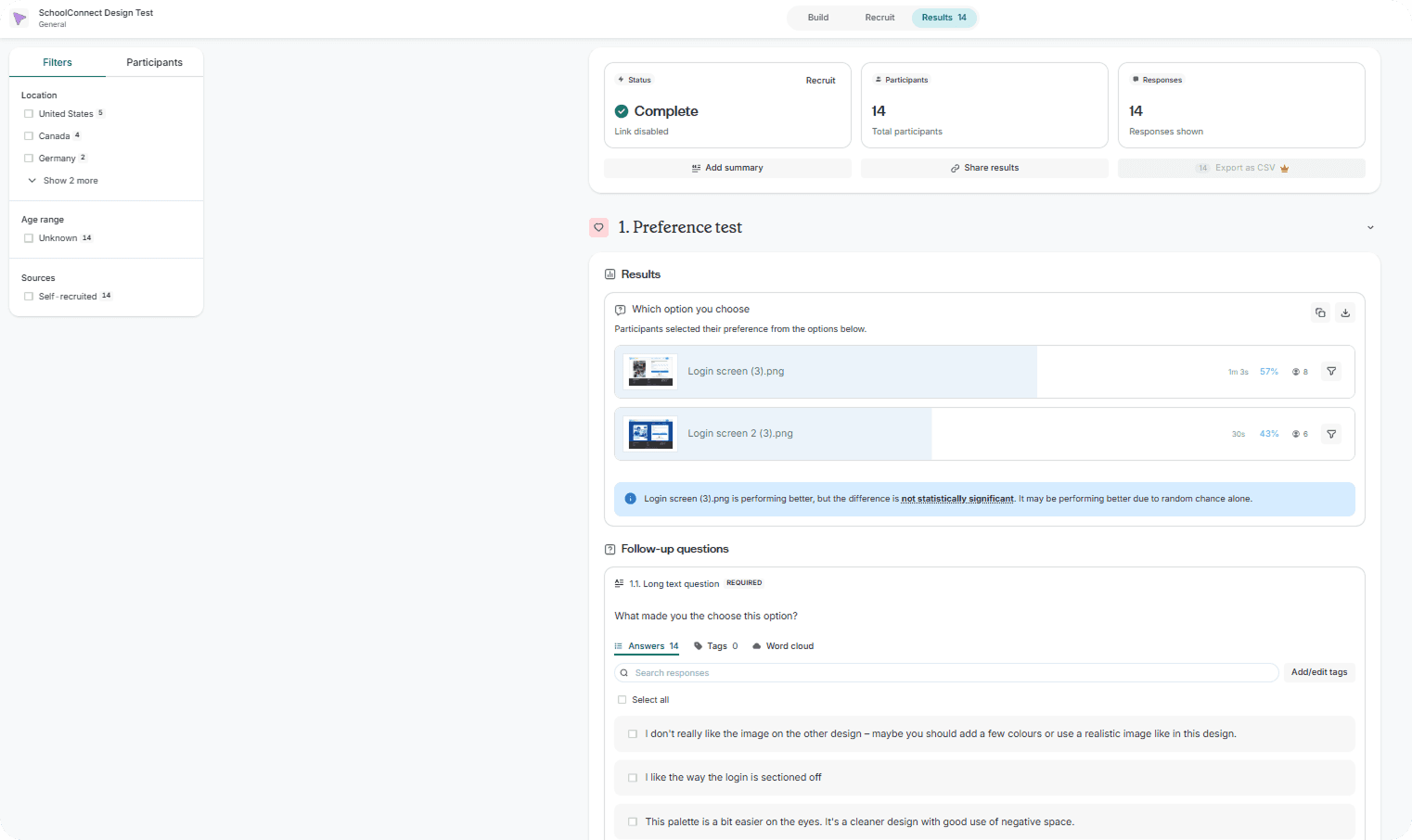
I tested two login screen directions in Lyssna to decide the entry experience: one illustrated on a dark background, one with a real photo and lighter background. The goal was to learn which felt more trustworthy and human before committing.
The result. The human, lighter version won 58% to 42%. Participants chose it for its professional, human touch, its authentic, familiar feel, and the personal connection of real imagery on a lighter background. The illustrated dark version felt abstract and corporate by comparison.
The decision. The 42% showed the losing option still held value, so I took a blended approach , keeping the real photography and lighter background, while pulling the strongest layout ideas from the other version into the final design.
High-Fidelity Design, Version 2 Redesign
A complete redesign, not a refresh. I rebuilt SchoolConnect on a unified design system and a new accessible palette, turning the tested first version into a scalable, consistent product.
Usability testing showed Version 1’s problems were systemic, not surface level, inconsistent colour, weak hierarchy, contrast gaps that couldn’t be patched screen by screen. So I made the strategic call to rebuild on a unified design system rather than fix screens individually. This stage covers how I got there: the visual direction that set the new look, the design system that made it reusable, and the redesigned screens across desktop and mobile.

Design System
The reusable foundation behind Version 2. Semantic tokens, a type scale, and a component library, so every screen draws from one source of truth.
From the visual direction I built a working system, not a set of one-off screens. Semantic colour tokens carry roles (navy for trust, teal for action, neutrals for calm), with Plus Jakarta Sans and Inter type and a reusable component library across desktop and mobile. This fixed Version 1's biggest weakness, where styling was applied screen by screen, so the design became consistent, accessible, and scalable.

Design Collaboration
I ran the rebuild through structured peer and mentor critique, logging each point as issue → fix → impact and carrying every resolution into the V2 system.
Peer & mentor critique → V2 decisions. Each row pairs a reviewer's observation with the specific fix it drove in the V2 rebuild and the impact it had.

Accessibility — WCAG 2.1 AA
My 17 years in QA, UAT, and user-experience testing shape how I treat accessibility, a measurable acceptance criterion, not a final checkbox. I audited V2 continuously against WCAG 2.1 AA using Stark and a contrast checker.
I audited every text/background pair across the system with Stark, and additionally ran the token set through Claude as a second-pass check to catch combinations the manual audit might miss. The failures weren't scattered , they traced to just two token values (a teal and a grey). I corrected each at the token level rather than screen by screen, so the fix propagated everywhere the token was used, then re-verified every element to AA.


Final Designs · Hi-Fi Mockups
Many flows were possible; I committed to the core student journey and made every branch a rational, defensible decision rather than adding screens for their own sake. Deeper research and my QA and UX-testing background surfaced edge cases and flow gaps early.
Final designs — the core student journey. Rather than exhaust every possible path, I scoped to the main happy-path flow — discover → evaluate → book → manage — and treated each remaining branch as a conscious decision, not an omission. To pressure-test the work, I ran the screens past Codex, Gemini, and Claude as peer reviewers, then applied my own judgment to every note: discarding feedback that was biased, redundant, or hallucinated, and keeping only what held up against real user logic. The result is a focused, intentional set of designs I can defend decision by decision.
Desktop

Mobile Web Responsive

DESIGN
With the structure and first build in place, I moved into refining the product. I treated this as an iteration loop, not a single pass: design, test, learn, and rebuild. Across two high-fidelity versions, SchoolConnect evolved from a functional first direction into a systematic, accessible product.
This stage walks through that journey. It covers the Version 1 high-fidelity design and the usability testing that exposed its gaps, the feedback I gathered and acted on, and the full Version 2 redesign built on a unified design system, with preference testing settling the final login. Every change traces back to a specific finding, so the result reflects evidence, not preference.
High-Fidelity Design, Version 1
My first high-fidelity build of SchoolConnect. A research-led colour direction, a preliminary palette, components, and icons, taken to a realistic, testable product.
I began with the visual language. To ground the colour direction in something students already trust, I studied leading education platforms including EdScholar, LinkedIn, Coursera, and Udemy, and added AI-assisted inspiration from ChatGPT and UX Pilot to widen the options and pressure-test them. Using colour theory, I developed two directions: a trustworthy blue with a warm orange accent, and a calmer teal and blue. I committed to blue and orange for Version 1 and deliberately parked the teal and blue as a tested alternative.
At this stage the system was intentionally preliminary, a first-round palette, a starter component set, and core icons, enough to take the wireframes to high fidelity. I had not yet formalised design tokens or a full component library. I then designed the core booking flow end to end, from pre-login discovery through booking and payment, to create the version I put in front of users in the next stage.
Usability Testing
I tested the Version 1 prototype with real users to find friction before refining the design. I ran moderated sessions with a structured test plan, task-based scenarios, and a severity scale.
I approached testing the way I run UAT on banking programs, with a plan before a single session. I wrote a moderated test plan covering goals, participants, tasks, tools, and a 0 to 4 severity scale, then prepared the task scenarios and questions for sign-up, expert discovery, profile viewing, booking, and payment.
I ran the study with 6 international students across remote and in-person sessions, asking each to think aloud while completing the core flows. I logged every issue with a severity rating and a clear change, so the redesign was driven by evidence, not preference. The findings exposed systemic problems, weak hierarchy, unclear pricing and free-trial visibility, and crowded filters, that pointed to a full redesign rather than screen-by-screen fixes.
Preference Testing
I tested two login screen directions in Lyssna to decide the entry experience: one illustrated on a dark background, one with a real photo and lighter background. The goal was to learn which felt more trustworthy and human before committing.
The result. The human, lighter version won 58% to 42%. Participants chose it for its professional, human touch, its authentic, familiar feel, and the personal connection of real imagery on a lighter background. The illustrated dark version felt abstract and corporate by comparison.
The decision. The 42% showed the losing option still held value, so I took a blended approach , keeping the real photography and lighter background, while pulling the strongest layout ideas from the other version into the final design.
High-Fidelity Design, Version 2
A complete redesign, not a refresh. I rebuilt SchoolConnect on a unified design system and a new accessible palette, turning the tested first version into a scalable, consistent product.
Usability testing showed Version 1’s problems were systemic, not surface level, inconsistent colour, weak hierarchy, contrast gaps that couldn’t be patched screen by screen. So I made the strategic call to rebuild on a unified design system rather than fix screens individually. This stage covers how I got there: the visual direction that set the new look, the design system that made it reusable, and the redesigned screens across desktop and mobile.
Design System
The reusable foundation behind Version 2. Semantic tokens, a type scale, and a component library, so every screen draws from one source of truth.
From the visual direction I built a working system, not a set of one-off screens. Semantic colour tokens carry roles (navy for trust, teal for action, neutrals for calm), with Plus Jakarta Sans and Inter type and a reusable component library across desktop and mobile. This fixed Version 1's biggest weakness, where styling was applied screen by screen, so the design became consistent, accessible, and scalable.
Design Collaboration
I ran the rebuild through structured peer and mentor critique, logging each point as issue → fix → impact and carrying every resolution into the V2 system.
Peer & mentor critique → V2 decisions. Each row pairs a reviewer's observation with the specific fix it drove in the V2 rebuild and the impact it had.
Accessibility — WCAG 2.1 AA
My 17 years in QA, UAT, and user-experience testing shape how I treat accessibility , a measurable acceptance criterion, not a final checkbox. I audit V2 against WCAG 2.1 AA continuously with Stark, a contrast checker, and AI reviewers (Claude Code, Codex, Gemini).
I audited every text/background pair across the system with Stark, and additionally ran the token set through Claude as a second-pass check to catch combinations the manual audit might miss. The failures weren't scattered , they traced to just two token values (a teal and a grey). I corrected each at the token level rather than screen by screen, so the fix propagated everywhere the token was used, then re-verified every element to AA.
Final Designs · Hi-Fi Mockups
Many flows were possible; I committed to the core student journey and made every branch a rational, defensible decision rather than adding screens for their own sake. Deeper research and my QA and UX-testing background surfaced edge cases and flow gaps early.
Final designs — the core student journey. Rather than exhaust every possible path, I scoped to the main happy-path flow — discover → evaluate → book → manage — and treated each remaining branch as a conscious decision, not an omission. To pressure-test the work, I ran the screens past Codex, Gemini, and Claude as peer reviewers, then applied my own judgment to every note: discarding feedback that was biased, redundant, or hallucinated, and keeping only what held up against real user logic. The result is a focused, intentional set of designs I can defend decision by decision.
Desktop
Mobile Web Responsive
DESIGN
With the structure and first build in place, I moved into refining the product. I treated this as an iteration loop, not a single pass: design, test, learn, and rebuild. Across two high-fidelity versions, SchoolConnect evolved from a functional first direction into a systematic, accessible product.
This stage walks through that journey. It covers the Version 1 high-fidelity design and the usability testing that exposed its gaps, the feedback I gathered and acted on, and the full Version 2 redesign built on a unified design system, with preference testing settling the final login. Every change traces back to a specific finding, so the result reflects evidence, not preference.
High-Fidelity Design, Version 1
My first high-fidelity build of SchoolConnect. A research-led colour direction, a preliminary palette, components, and icons, taken to a realistic, testable product.
I began with the visual language. To ground the colour direction in something students already trust, I studied leading education platforms including EdScholar, LinkedIn, Coursera, and Udemy, and added AI-assisted inspiration from ChatGPT and UX Pilot to widen the options and pressure-test them. Using colour theory, I developed two directions: a trustworthy blue with a warm orange accent, and a calmer teal and blue. I committed to blue and orange for Version 1 and deliberately parked the teal and blue as a tested alternative.
At this stage the system was intentionally preliminary, a first-round palette, a starter component set, and core icons, enough to take the wireframes to high fidelity. I had not yet formalised design tokens or a full component library. I then designed the core booking flow end to end, from pre-login discovery through booking and payment, to create the version I put in front of users in the next stage.
Usability Testing
I tested the Version 1 prototype with real users to find friction before refining the design. I ran moderated sessions with a structured test plan, task-based scenarios, and a severity scale.
I approached testing the way I run UAT on banking programs, with a plan before a single session. I wrote a moderated test plan covering goals, participants, tasks, tools, and a 0 to 4 severity scale, then prepared the task scenarios and questions for sign-up, expert discovery, profile viewing, booking, and payment.
I ran the study with 6 international students across remote and in-person sessions, asking each to think aloud while completing the core flows. I logged every issue with a severity rating and a clear change, so the redesign was driven by evidence, not preference. The findings exposed systemic problems, weak hierarchy, unclear pricing and free-trial visibility, and crowded filters, that pointed to a full redesign rather than screen-by-screen fixes.
High-Fidelity Design, Version 2
A complete redesign, not a refresh. I rebuilt SchoolConnect on a unified design system and a new accessible palette, turning the tested first version into a scalable, consistent product.
Usability testing showed Version 1’s problems were systemic, not surface level, inconsistent colour, weak hierarchy, contrast gaps that couldn’t be patched screen by screen. So I made the strategic call to rebuild on a unified design system rather than fix screens individually. This stage covers how I got there: the visual direction that set the new look, the design system that made it reusable, and the redesigned screens across desktop and mobile.
Design System
The reusable foundation behind Version 2. Semantic tokens, a type scale, and a component library, so every screen draws from one source of truth.
From the visual direction I built a working system, not a set of one-off screens. Semantic colour tokens carry roles (navy for trust, teal for action, neutrals for calm), with Plus Jakarta Sans and Inter type and a reusable component library across desktop and mobile. This fixed Version 1’s biggest weakness, where styling was applied screen by screen, so the design became consistent, accessible, and scalable.
Design Collaboration
I ran the rebuild through structured peer and mentor critique, logging each point as issue → fix → impact and carrying every resolution into the V2 system.
Peer & mentor critique → V2 decisions. Each row pairs a reviewer’s observation with the specific fix it drove in the V2 rebuild and the impact it had.
Accessibility — WCAG 2.1 AA
My 17 years in QA, UAT, and user-experience testing shape how I treat accessibility — a measurable acceptance criterion, not a final checkbox. I audit V2 against WCAG 2.1 AA continuously with Stark, a contrast checker, and AI reviewers (Claude Code, Codex, Gemini).
I audited every text/background pair across the system with Stark, and additionally ran the token set through Claude as a second-pass check to catch combinations the manual audit might miss. The failures weren't scattered , they traced to just two token values (a teal and a grey). I corrected each at the token level rather than screen by screen, so the fix propagated everywhere the token was used, then re-verified every element to AA.
Final Designs · Hi-Fi Mockups
Many flows were possible; I committed to the core student journey and made every branch a rational, defensible decision rather than adding screens for their own sake. Deeper research and my QA and UX-testing background surfaced edge cases and flow gaps early.
Final designs — the core student journey. Rather than exhaust every possible path, I scoped to the main happy-path flow — discover → evaluate → book → manage — and treated each remaining branch as a conscious decision, not an omission. To pressure-test the work, I ran the screens past Codex, Gemini, and Claude as peer reviewers, then applied my own judgment to every note: discarding feedback that was biased, redundant, or hallucinated, and keeping only what held up against real user logic. The result is a focused, intentional set of designs I can defend decision by decision.
Desktop
Mobile Web Responsive
Outcome
The result is a tested, accessible, and handoff-ready design, taken from a validated problem to a buildable solution. What follows is what I delivered, what changed, and where I'd take it next.
Prototype
I wired the core booking journey into a clickable prototype.
The full happy path, wired end to end: exploring the pre-login site → registration → login → Find Advisor → Advisor Profile → Book Session → Confirmation → My Sessions. This covers the entire path a new student takes, from landing as a stranger to managing a booked consultation. Error and edge states are documented through annotated spec screens rather than wired, keeping the prototype focused on the core journey. The prototype proves the flow works; the spec screens prove I designed past it.
Takeaways
The booking flow held up, what broke was clarity, not concept. The bigger lesson: a strong structure can survive a full visual overhaul.
Impact:
The work moved SchoolConnect from a validated problem to a tested, accessible, handoff-ready design. Testing on V1 directly reshaped it:
Bundled chat with video instead of selling it separately
Surfaced the free first session earlier
Reorganized the filter hierarchy and fixed broken navigation
Passed a WCAG 2.1 AA audit, correcting the old blue/orange contrast failures
What I learned:
The most valuable decisions came from taking testing and accessibility findings seriously rather than protecting my first version. My QA and business-analysis background pushed me to design for edge cases and traceability from the start, marking error and edge states, documenting why each change was made, which made the system far easier to refine and hand off. I also learned to scope honestly: shipping a clean discovery-to-booking flow well beats half-building every feature in the brief.
Next Steps
What I'd build and validate next, extending the product beyond the student booking flow and pressure-testing it with real users
Build & extend
Build out edge-case flows — double-booking attempts, session history, improved settings
Add retention loops — refer-a-friend and a free session after three completed
Build the professor side end-to-end — login, verification, and a dashboard mirroring the student structure
Take SchoolConnect native — iOS and Android apps with push reminders for booked sessions
Validate & refine
Re-test V2 — another round of usability and WCAG accessibility audits
Test with real international students — the actual target users
Enhance the UI with live data — replace static states with data-driven screens
Track impact — A/B tests, surveys, and analytics
Outcome
The result is a tested, accessible, and handoff-ready design, taken from a validated problem to a buildable solution. What follows is what I delivered, what changed, and where I'd take it next.
Outcome
The result is a tested, accessible, and handoff-ready design, taken from a validated problem to a buildable solution. What follows is what I delivered, what changed, and where I'd take it next.
Prototype
I wired the core booking journey into a clickable prototype.
The full happy path, wired end to end: exploring the pre-login site → registration → login → Find Advisor → Advisor Profile → Book Session → Confirmation → My Sessions. This covers the entire path a new student takes, from landing as a stranger to managing a booked consultation. Error and edge states are documented through annotated spec screens rather than wired, keeping the prototype focused on the core journey. The prototype proves the flow works; the spec screens prove I designed past it.
Takeaways
The booking flow held up, what broke was clarity, not concept. The bigger lesson: a strong structure can survive a full visual overhaul.
Impact:
The work moved SchoolConnect from a validated problem to a tested, accessible, handoff-ready design. Testing on V1 directly reshaped it:
Bundled chat with video instead of selling it separately
Surfaced the free first session earlier
Reorganized the filter hierarchy and fixed broken navigation
Passed a WCAG 2.1 AA audit, correcting the old blue/orange contrast failures
What I learned:
The most valuable decisions came from taking testing and accessibility findings seriously rather than protecting my first version. My QA and business-analysis background pushed me to design for edge cases and traceability from the start, marking error and edge states, documenting why each change was made, which made the system far easier to refine and hand off. I also learned to scope honestly: shipping a clean discovery-to-booking flow well beats half-building every feature in the brief.
Next Steps
What I'd build and validate next, extending the product beyond the student booking flow and pressure-testing it with real users.
Build & extend
Build out edge-case flows — double-booking attempts, session history, improved settings
Add retention loops — refer-a-friend and a free session after three completed
Build the professor side end-to-end — login, verification, and a dashboard mirroring the student structure
Take SchoolConnect native — iOS and Android apps with push reminders for booked sessions
Validate & refine
Re-test V2 — another round of usability and WCAG accessibility audits
Test with real international students — the actual target users
Enhance the UI with live data — replace static states with data-driven screens
Track impact — A/B tests, surveys, and analytics
Prototype
I wired the core booking journey into a clickable prototype.
The full happy path, wired end to end: exploring the pre-login site → registration → login → Find Advisor → Advisor Profile → Book Session → Confirmation → My Sessions. This covers the entire path a new student takes, from landing as a stranger to managing a booked consultation. Error and edge states are documented through annotated spec screens rather than wired, keeping the prototype focused on the core journey. The prototype proves the flow works; the spec screens prove I designed past it.
Takeaways
The booking flow held up, what broke was clarity, not concept. The bigger lesson: a strong structure can survive a full visual overhaul.
Impact:
The work moved SchoolConnect from a validated problem to a tested, accessible, handoff-ready design. Testing on V1 directly reshaped it:
Bundled chat with video instead of selling it separately
Surfaced the free first session earlier
Reorganized the filter hierarchy and fixed broken navigation
Passed a WCAG 2.1 AA audit, correcting the old blue/orange contrast failures
What I learned:
The most valuable decisions came from taking testing and accessibility findings seriously rather than protecting my first version. My QA and business-analysis background pushed me to design for edge cases and traceability from the start, marking error and edge states, documenting why each change was made, which made the system far easier to refine and hand off. I also learned to scope honestly: shipping a clean discovery-to-booking flow well beats half-building every feature in the brief.
Next Steps
What I'd build and validate next, extending the product beyond the student booking flow and pressure-testing it with real users.
Build the professor side end-to-end, login, automatic verification, and a dashboard mirroring the student structure (currently only a "For Professors" entry point)
Add the recommendation engine to surface 3–5 relevant experts and cut choice overload
Add an async "Send a Question" option to lower hesitation before booking
Add retention features like refer-a-friend and the free-session-after-three-completed loyalty loop
Validate & refine
Re-test V2 with another round of usability and accessibility (WCAG) audits
Test with real international students — the actual target users — to pressure-test the experience
Enhance the UI with live data — replace static states with real content and data-driven screens
Track impact through A/B tests, surveys, and analytics