Indeed Redesign Case Study
Role
Role
Product Designer
Product Designer
Year
Year
2025
2025
Duration
Duration
12 Weeks
12 Weeks
Platform
Platform
Mobile • Desktop • Tablet


The project itself :
The Indeed Entry‑Level Experience redesign focuses on reducing decision anxiety for early‑career job seekers by creating a dedicated, guided job‑search and application flow within the logged‑in experience.
The project addresses the cognitive overload fresh graduates face when navigating a platform designed primarily for experienced professionals.
Rather than introducing new features, this redesign prioritizes clarity, guidance, and confidence, helping users understand whether they qualify, what to do next, and how to apply without second‑guessing themselves.
Indeed’s current job search experience is designed for a broad range of users, which creates friction for entry-level job seekers. Fresh graduates and early-career applicants face cognitive overload from mixed seniority roles, unclear requirements, and filters that require self-judging eligibility. This uncertainty leads to hesitation, loss of confidence, and abandoned applications, even when users are qualified.
Design a dedicated, entry-level job search and application experience that reduces decision anxiety and builds confidence. The goal is to simplify discovery, provide clear guidance at every step, and help first-time job seekers understand requirements and apply without second-guessing,while staying aligned with Indeed’s existing ecosystem and brand.
Senior Product Designer, leading the project end-to-end. I owned the experience strategy, interaction design, and visual execution across desktop, tablet, and mobile, focusing on creating a guided, confidence-building flow for entry-level users within the logged-in Indeed experience
• Conducting secondary research
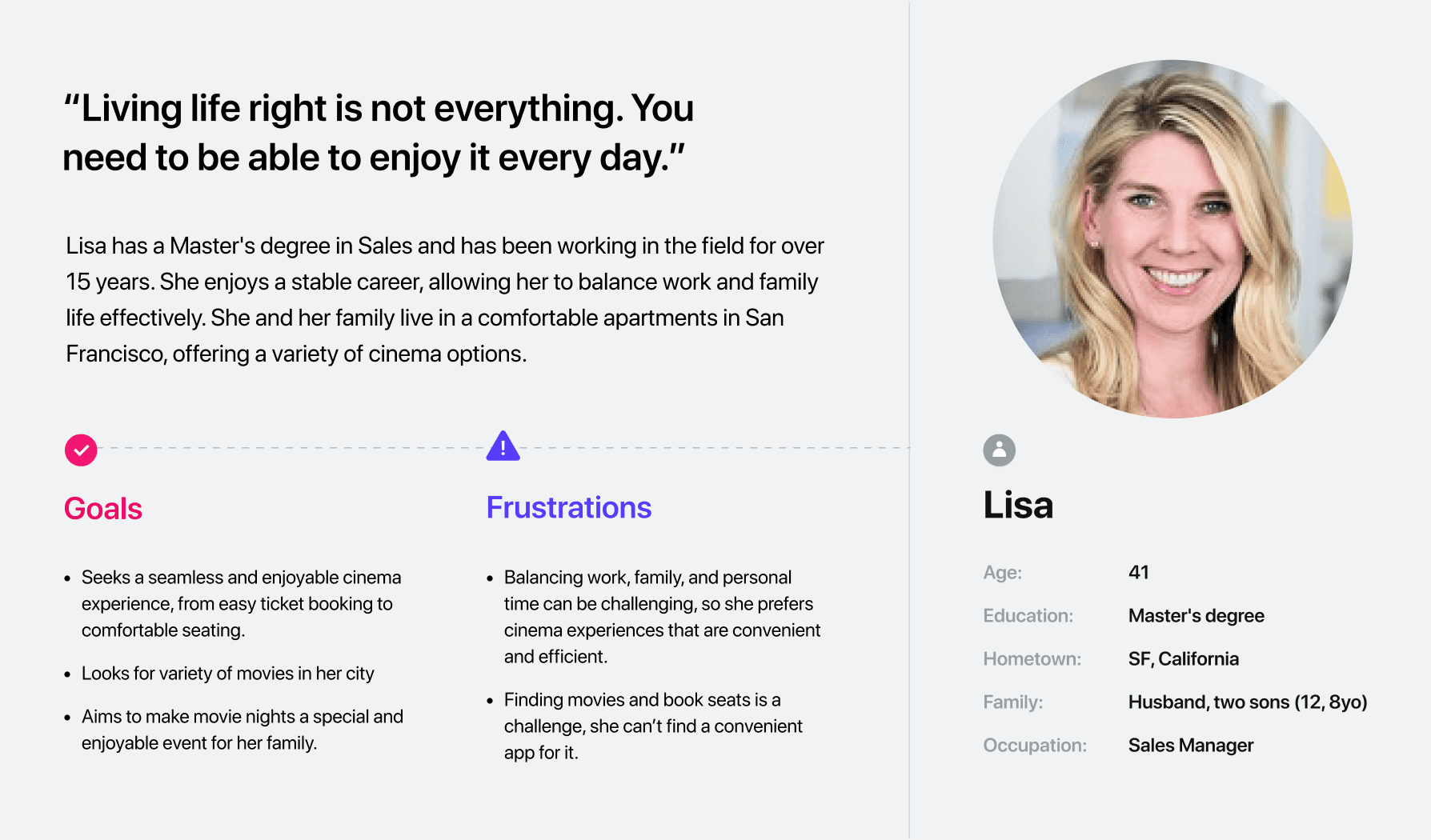
Defining personas, user needs
Creating user flows
Designing low-fidelity digital wireframes
Iterating designs
Developing high-fidelity prototypes
Building responsive application prototypes
Accessibility Testing
This redesign introduces a dedicated entry‑level flow that simplifies discovery and guides users step‑by‑step
through the application process. The experience is intentionally scoped to reduce cognitive load while
preserving Indeed’s core functionality.
Key principles behind the solution:
• Clarity over clutter
• Guidance over choice
• Confidence over speed
All about the user :
During discovery, I conducted secondary research using community feedback from platforms like Reddit and Quora to understand entry-level job seeker frustrations. A clear pattern emerged: users hesitate to apply due to uncertainty about eligibility. “Entry-level” roles often imply experience, leading to wasted time and application fatigue. This revealed that the core problem was not discoverability, but confidence.
Entry-level job seekers struggle to find relevant roles because entry-level and senior positions are mixed together. Filters require users to self-judge eligibility, leading to wasted time and frustration.
Job requirements are difficult to scan and interpret. Many roles labeled “entry-level” still imply prior experience, causing users to doubt their qualifications and hesitate before applying.
The application process feels intimidating and high-risk for first-time applicants. Lack of guidance and unclear next steps increase anxiety, resulting in abandoned applications despite genuine interest.
This user journey map captures the key experiences of an entry-level job seeker while finding and applying for a role on Indeed. It highlights emotional and behavioral moments of hesitation, confusion, and confidence to uncover pain points and improvement opportunities across the journey.


It is the series of experiences Carlos has as he achieve a specific goal. It was built on the his experience.
I developed a user journey map to understand the experience of an entry-level job seeker using Indeed, highlighting moments of hesitation, confidence, and opportunities for improvement.
Find relevant entry-level job opportunities and complete applications in a clear, guided, and confidence-building way.

The project schematically :
Starting the design, I created user flows, diagrams, and storyboards to analyze the information architecture and clarify how entry-level users navigate the platform. I mapped the post-login journey to reduce hesitation around applying and sketched paper wireframes to simplify filters and job discovery. I then transitioned to digital low-fidelity wireframes in Figma and built an interactive prototype to test the guided apply flow with stakeholders. After refining the structure and hierarchy, I translated the validated flow into high-fidelity responsive designs aligned with the defined visual system.
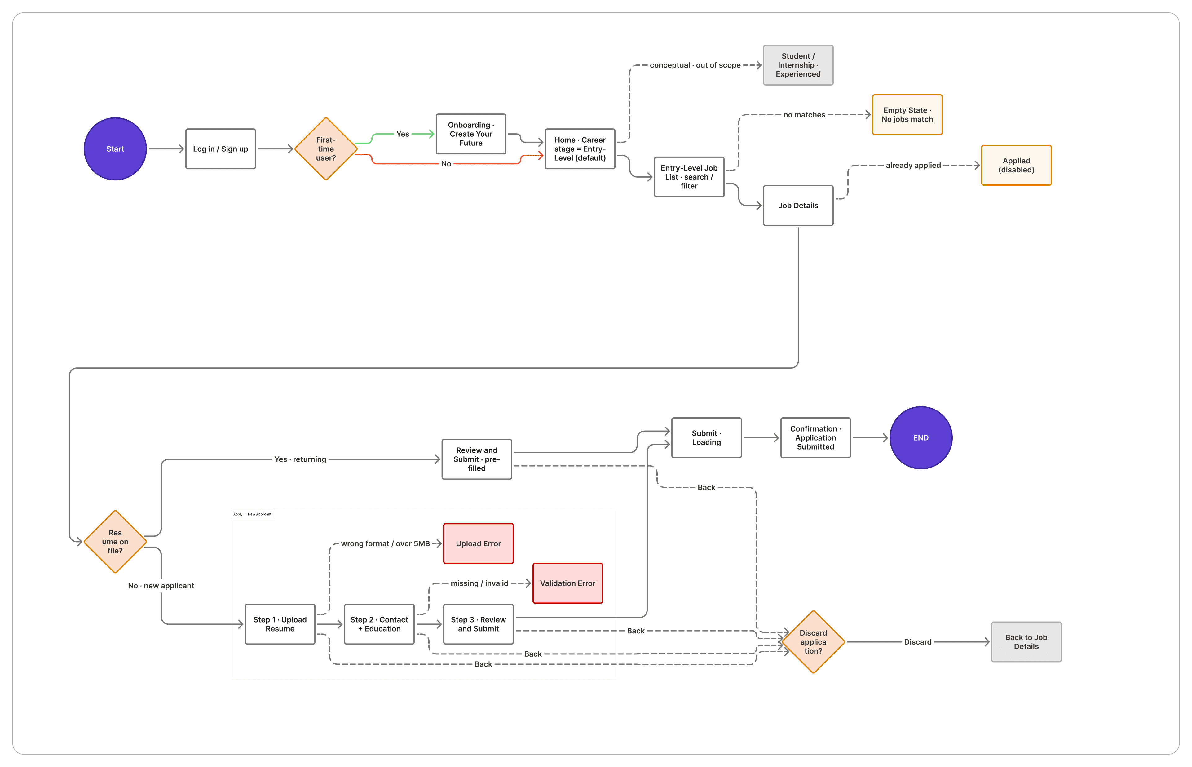
This user flow demonstrates how a returning user logs in, navigates to entry-level roles, selects a job, and completes the application with minimal friction.
I created this user flow by analyzing the existing Indeed structure and identifying friction points for both new and returning users. The flow separates entry-level and student paths, simplifies search and filter decisions, and clearly branches the apply process for new users (upload resume) and returning users (reuse/update resume). The goal was to reduce hesitation, minimize steps, and guide users smoothly from job discovery to submission.

t is a structured framework that defines the app’s page organization and content hierarchy. It ensures users can navigate logically from job discovery to application without confusion or unnecessary steps
As a UI designer, I structured the information architecture by first analyzing the full user journey from login to confirmation and identifying decision-heavy moments. I grouped screens based on user intent (Discover → Evaluate → Apply → Confirm) and reduced unnecessary branching to make progression predictable. I separated new and returning user logic early in the apply stage to avoid cognitive overload. Every page was designed to show only the information required for that step, supporting clarity and momentum.
They initially oriented on the basic structure of the homepage and highlight the intended function of each element.
The primary focus during this stage was designing for a mobile-responsive UI. I explored five different structural variations for organizing information on the homepage to evaluate layout clarity and hierarchy. After reviewing each version, I synthesized the strongest elements into one refined structure that best supported simplicity and usability.

More "clear" version of wireframes in a digital form. Also all the important pages are added
in it.
After sketching early paper wireframes to explore layout structure and reduce complexity, I translated those concepts into digital low-fidelity wireframes in Figma. The prototype visualizes the complete entry-level journey from home screen and job list to job details, resume upload, contact information, review, and confirmation.
Each screen was intentionally designed with minimal visual noise, clear hierarchy, and guided progression to make the apply process feel manageable rather than overwhelming.

I conducted unmoderated usability testing with two participants using the initial low-fidelity wireframes of the Indeed Entry-Level redesign..
Participants completed core tasks such as browsing entry-level jobs and submitting an application while sharing observations. The testing focused on identifying moments of mild confusion or hesitation so the experience could be simplified further before final design implementation.
•
Some participants experienced minor confusion seeing Student, Internship, and Experienced roles displayed together.
•
A few paused briefly to determine which section applied to them.
•
A couple of participants expected filtering options earlier in the process.
•
Converted career level options into a dropdown selector.
•
A few paused briefly to determine which section applied to them.
•
A couple of participants expected filtering options earlier in the process.
The project schematically :
Starting the design, I created user flows, diagrams, and storyboards to analyze the information architecture and clarify how entry-level users navigate the platform. I mapped the post-login journey to reduce hesitation around applying and sketched paper wireframes to simplify filters and job discovery. I then transitioned to digital low-fidelity wireframes in Figma and built an interactive prototype to test the guided apply flow with stakeholders. After refining the structure and hierarchy, I translated the validated flow into high-fidelity responsive designs aligned with the defined visual system.
This user flow demonstrates how a returning user logs in, navigates to entry-level roles, selects a job, and completes the application with minimal friction.
I created this user flow by analyzing the existing Indeed structure and identifying friction points for both new and returning users. The flow separates entry-level and student paths, simplifies search and filter decisions, and clearly branches the apply process for new users (upload resume) and returning users (reuse/update resume). The goal was to reduce hesitation, minimize steps, and guide users smoothly from job discovery to submission.

t is a structured framework that defines the app’s page organization and content hierarchy. It ensures users can navigate logically from job discovery to application without confusion or unnecessary steps
As a UI designer, I structured the information architecture by first analyzing the full user journey from login to confirmation and identifying decision-heavy moments. I grouped screens based on user intent (Discover → Evaluate → Apply → Confirm) and reduced unnecessary branching to make progression predictable. I separated new and returning user logic early in the apply stage to avoid cognitive overload. Every page was designed to show only the information required for that step, supporting clarity and momentum.
They initially oriented on the basic structure of the homepage and highlight the intended function of each element.
The primary focus during this stage was designing for a mobile-responsive UI. I explored five different structural variations for organizing information on the homepage to evaluate layout clarity and hierarchy. After reviewing each version, I synthesized the strongest elements into one refined structure that best supported simplicity and usability.

More "clear" version of wireframes in a digital form. Also all the important pages are added
in it.
After sketching early paper wireframes to explore layout structure and reduce complexity, I translated those concepts into digital low-fidelity wireframes in Figma. The prototype visualizes the complete entry-level journey from home screen and job list to job details, resume upload, contact information, review, and confirmation.
Each screen was intentionally designed with minimal visual noise, clear hierarchy, and guided progression to make the apply process feel manageable rather than overwhelming.

I conducted unmoderated usability testing with two participants using the initial low-fidelity wireframes of the Indeed Entry-Level redesign..
Participants completed core tasks such as browsing entry-level jobs and submitting an application while sharing observations. The testing focused on identifying moments of mild confusion or hesitation so the experience could be simplified further before final design implementation.
•
Some participants experienced minor confusion seeing Student, Internship, and Experienced roles displayed together.
•
A few paused briefly to determine which section applied to them.
•
A couple of participants expected filtering options earlier in the process.
•
Converted career level options into a dropdown selector.
•
A few paused briefly to determine which section applied to them.
•
A couple of participants expected filtering options earlier in the process.
The clear version :
In this phase, I refined the mid-fidelity wireframes by incorporating insights gathered from usability testing, focusing on improving hierarchy, reducing clutter, and simplifying decision points. The updated screens represented a clearer and more structured version of the final experience while still allowing flexibility for iteration.
After validating the refined layouts, I translated them into high-fidelity design mockups and built an interactive prototype to simulate the complete entry-level job search and application journey.
These are a high fidelity design that represents a final product
For visual direction, I reviewed patterns and UI references on Mobbin, Dribbble & AI tools to understand the look-and-feel of polished job and onboarding experiences. I used this research to guide my choices around color inspiration, typography, spacing, and component styling, ensuring the final UI feels modern, approachable, and confidence-building for entry-level usersThe visual system was designed to feel calm, supportive, and trustworthy.

A cohesive design foundation that defines the app’s visual identity through structured color scales, accessible typography, and consistent UI components to ensure clarity, scalability, and brand alignment.
After defining the visual direction, I explored multiple color palettes and typography systems by reviewing design inspiration across platforms such as Relume, Dribbble, and other UI pattern libraries, while also leveraging AI tools to experiment with variations and accessibility contrast. I implemented the system in Figma by creating structured variables for all color primitives and semantic tokens, and built a comprehensive style guide covering typography scales, spacing, padding, border radius, elevation, text colors, and surface colors. The final design system ensures visual consistency, scalability, and accessibility while staying aligned with Indeed’s brand foundation and presenting a more modern, approachable tone for entry-level job seekers.
Detailed, interactive version of the design that closely reflects the final product’s visual style, functionality, and overall user experience
• Transformed low- and mid-fidelity wireframes into a polished mobile-first interface
Refined typography, color usage, and component consistency to align with the entry-level confidence theme.
Strengthened visual cues such as career-level tags, step indicators, and CTA prominence.
Simplified filter access and improved dropdown behavior based on usability feedback.
Designed guided, step-based apply screens to feel predictable and manageable.
Focused on thumb-friendly interactions and clean vertical flow for mobile usability.

Usability testing sessions with senior designers
After usability testing sessions with senior designers, I refined the experience to reduce friction and remove unnecessary distractions. The updates focused on simplifying navigation, strengthening clarity on the landing page, and keeping users fully engaged during the application process.
Key Improvements
Moved search functionality directly onto the landing page to eliminate an extra navigation step.
Integrated the search bar within the hero section and updated the hero messaging for stronger intent and clarity.
Added visible search filters on the landing page for quicker job refinement.
Removed the previously added “Need Career Help?” text and link based on feedback to reduce visual clutter.
Eliminated top navigation elements (messages, notifications, profile) during the application stepper to avoid distraction.
Removed the bottom navigation during the apply flow to prevent unintended exits and maintain focus until submission.

Project Structure Overview
The final outcome was a focused, mobile-first redesign that feels intentional, confidence-building, and structured — helping entry-level users move from discovery to application with less uncertainty.
•
Small structural changes can significantly reduce hesitation.
•
Removing distractions often improves task completion more than adding features.
•
Clear hierarchy and step-based flows create predictability and trust.
•
Improved clarity in career-stage selection.
•
Reduced unnecessary navigation during application steps.
•
Created a more guided, streamlined experience aligned with entry-level needs.
I learned that simplifying an experience does not mean reducing functionality , it means prioritizing intention. Even minor layout adjustments, such as relocating search or removing navigation during critical steps, can significantly influence user confidence and completion rates. I also learned the importance of testing assumptions early and iterating quickly based on structured feedback.
•
Conduct additional usability testing with a broader group of recent graduates.
•
Further refine filters and job card clarity based on behavioral insights.
•
Expand and optimize responsive designs for tablet and desktop experiences.
•
Explore enhancements such as improved application tracking and saved job management across devices.